Understanding the role of color in consumer perception
Color plays a crucial role in how consumers perceive cosmetic products.
It can instantly convey emotions, suggest product benefits, and influence purchasing decisions. For brands, choosing the right color scheme is not just an aesthetic decision—it’s a strategic move to align with consumer psychology.
Research shows that colors can evoke specific feelings: red can create a sense of urgency or excitement, while blue often communicates trust and calmness. Understanding these associations allows cosmetic brands to design packaging that not only attracts attention but also subtly influences consumer behavior.
Red: stimulating passion and energy
Red is a bold color that often signals energy, passion, and excitement. In cosmetic packaging, red can be used to highlight products that aim to energize, refresh, or provide a bold statement, such as lipsticks or vibrant nail polishes.
However, red must be used carefully. Overuse can create a sense of aggressiveness or overstimulation. Brands often combine red with softer tones like pink or white to balance intensity while maintaining its attention-grabbing qualities.
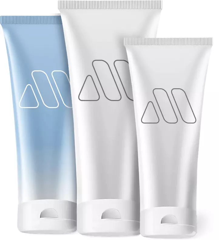
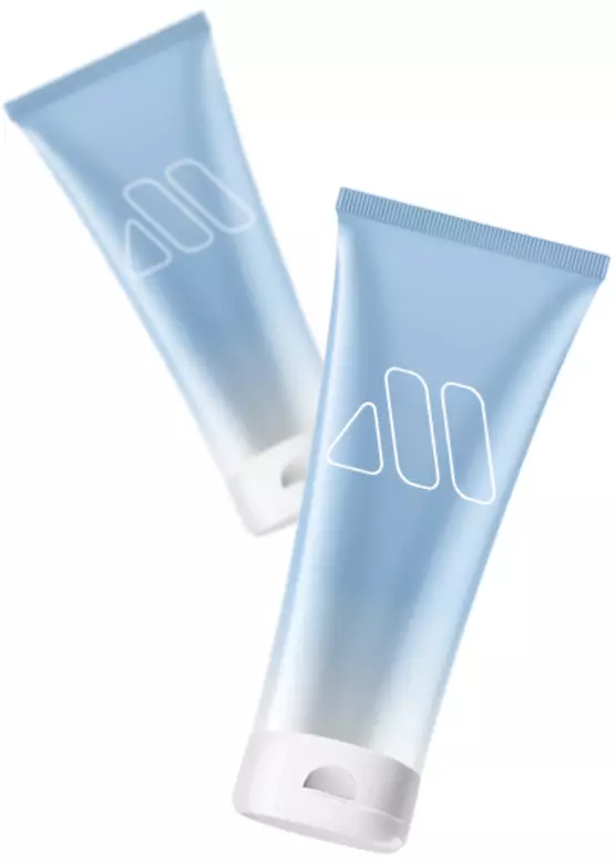
Blue: trust, calm, and reliability
Blue is widely associated with trust, serenity, and professionalism. Skincare brands often incorporate shades of blue to communicate safety, reliability, and soothing qualities. It suggests that a product is gentle, effective, and scientifically credible.
Different shades of blue can evoke varying emotions. Light blues are calming and refreshing, while darker blues convey sophistication and authority. Choosing the right tone can help brands target the desired consumer mindset effectively.
Green: health, nature, and sustainability
Green is strongly linked to health, wellness, and eco-consciousness. Cosmetic brands that emphasize natural ingredients or sustainability often use green to reinforce their environmentally friendly message. It signals freshness and organic qualities to eco-minded consumers.
Using green strategically can enhance the perception of a product’s natural benefits. Combining green with earthy tones like brown or beige can strengthen the association with nature, while a vibrant green can communicate energy and vitality.
Pink and purple: femininity and creativity
Pink often represents softness, femininity, and romance, making it ideal for products targeting a predominantly female audience. It conveys gentle, nurturing qualities that resonate with cosmetics like moisturizers and blushes.
Purple, on the other hand, is linked to luxury, creativity, and sophistication. High-end cosmetic brands frequently use purple to suggest exclusivity and indulgence. Pairing these colors thoughtfully can appeal to consumers seeking both beauty and elegance.
Black and white: minimalism and elegance
Black and white are staples of minimalist and high-end packaging. Black conveys sophistication, luxury, and power, while white symbolizes purity, simplicity, and cleanliness. Together, they can create a timeless and versatile design.
Many brands use black and white combinations to stand out in a crowded market. The contrast ensures legibility and highlights product names, while subtle design elements maintain elegance and appeal to discerning consumers.
Practical tips for applying color psychology in packaging
To effectively use color psychology, brands should first define their target audience and brand personality. Understanding the emotional triggers of potential consumers allows brands to select colors that resonate and encourage positive associations – https://mpackpoland.com.
Testing and iteration are essential. Brands can use focus groups, surveys, and A/B testing to evaluate how different color schemes influence perception and sales. Strategic application of color psychology can ultimately strengthen brand identity, boost consumer engagement, and increase product success in the competitive cosmetics market.